Masthead Analysis and Design
In this blog post I am going to be analyzing the masthead of different fitness magazines in order to have an idea of what I want my magazine's masthead to look like.
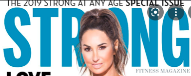
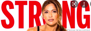
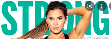
In "Strong" magazine, the masthead is always bold, large and all caps, but they often change the its color. Their masthead is a perfect example of how to catch the audience's eye. Most of the times, the masthead is partially covered by the model's head to make them stand out on the cover.


"Shape" follows a similar conventions, their masthead is large, bold, and all caps. The color of the letters also tend to change to different vibrant colors and there is more space between each letter. Most of the times, the letter "A" in the masthead is replaced by the model's head to make the appearance of the cover more playful.
For my magazine tittle block, I want to use a font similar to Staatliches or Impact. I will follow the conventions of the Fitness magazines: bold, big and colorful.
Here are some examples:


No comments:
Post a Comment