Saturday, February 5, 2022

Masthead Analysis and Design

 Masthead Analysis and Design

In this blog post I am going to be analyzing the masthead of different fitness magazines in order to have an idea of what I want my magazine's masthead to look like.


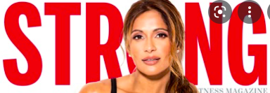
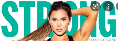
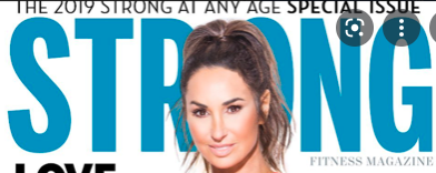
In "Strong" magazine, the masthead is always bold, large and all caps, but they often change the its color. Their masthead is a perfect example of how to catch the audience's eye. Most of the times, the masthead is partially covered by the model's head to make them stand out on the cover. 


"Shape" follows a similar conventions, their masthead is large, bold, and all caps. The color of the letters also tend to change to different vibrant colors and there is more space between each letter. Most of the times, the letter "A" in the masthead is replaced by the model's head to make the appearance of the cover more playful. 

For my magazine tittle block, I want to use a font similar to Staatliches or Impact. I will follow the conventions of the Fitness magazines: bold, big and colorful. 


Here are some examples:


Thursday, February 3, 2022

Audience Profile- Fitness magazine

 Audience Profile- Fitness magazine

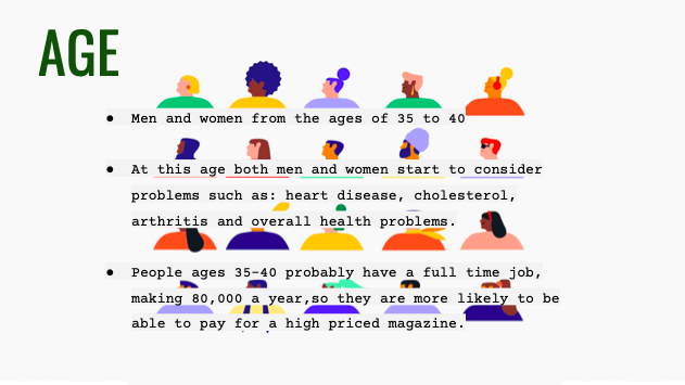
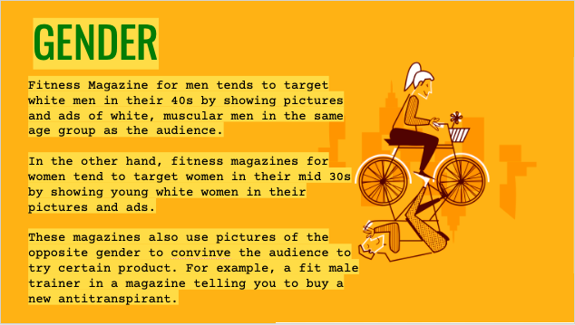
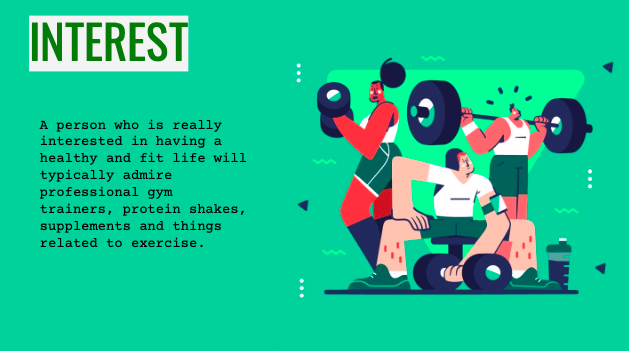
For this week's blog post I did a brief research on my fitness magazine's audience. I found out their ages, which gender reads this type f magazine the most, what their interests are and which ethnicity is most likely to appear in fitness magazines.


Fitness Magazine Questionnaire

 Fitness Magazine Questionnaire 

https://docs.google.com/forms/d/100WzTirwyYV1DQv23SLb54b1tgxL7JKrHg83sM5_qT8/prefill 


More of the people who filled out my questionnaire preferred to see a celebrity in the cover of the magazine. I believe this is a great option because it is most likely to catch a reader's eye if they see someone they recognize. 


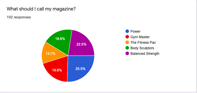
The most popular name voted for the magazine was "Power", which I will change for "The Power" because it sounds better.


The majority voted for seeing workout routines and nutrition and health info.


More of the votes went for purple and black as the color scheme, however, I am going to choose yellow and turquoise because those colors are more common to see in a Fitness Magazine.


The option that was voted the most was to take the photographs at a gym. This is because when people think about fitness, they automatically think of doing exercise and going to gym.


The majority voted to see articles of the latest workout routines in the front cover of the magazine.


The most popular option here was for the model of the cover to be lifting weights at the gym. But I would prefer the model to be stretching in the photographs.


The option which was voted the most was the one where the model would have to wear black exercise clothes and the second most voted was colorful exercise clothes , which is my favorite option. 


Tuesday, January 18, 2022

Second Preliminary Research

 Cover Page Analysis

In all fitness magazines, these are the main conventions that are found:
-Full shot of the models
-Models wearing exercise clothes
-Thin/fit models
-Large mastheads


Sunday, January 9, 2022

Preliminary Research Blog Post

Fitness Magazine- Step 1

Fitness Magazine

For my project, I am considering in doing a fitness magazine. First, I am going to do a research about the conventions of a fitness magazine.


1.Genre of choice: Fitness Magazine


2.Genre conventions: Content

- In my magazine, most of the articles would be about how to stay healthy. Some examples of this type of articles would be: nutrition tips, workout routines, weight loss tips and interviews with famous athletes in which the would share their secret to obtain a healthy body. There would also be articles about different type of sports or marathons for those that are sport aficionados. 


3.Genre conventions: Production techniques

-In a magazine, there are several important elements that are crucial to its design. Such as :

-the Masthead: the name of the magazine, Main headline: the main message of the cover, Image, Image captions, running head, Byline and body copy.


4. Institutional conventions: How is the genre marketed?

- The target audience of my fitness magazine would be for men and women who are fitness enthusiastic, that want to change their lifestyle so they can be healthier, healthcare practitioners, athletes and sport aficionados.

5. Sample #1

-The cover of the Outdoor magazine serves as a perfect example of what I want my fitness magazine to look like. In the cover of this magazine we can observe that there is the picture of a woman running, surrounded by different headings about diets running tips and more.


6.Sample #2

-In the cover of this magazine we can observe a man and a woman with toned bodies, this image catches the eye's audience and also makes reference to one of the articles "secrets to fast track your six-pack". There is also more articles that give tips about diets and training.

7. Other samples:


8. Representation:

- The specific type of people and qualities that are portrayed in the cover of the fitness magazines are most likely to be good looking men and women that promote the look of a healthy, strong and toned body. In most of the covers this individuals are either smiling or have a serious look on their faces. The smile portrays the idea that doing exercise and working out makes you a happy person, while the serious face portrays that exercise helps you by making you more determined and self-disciplined.

9. Links:

-https://www.outsource2india.com/creative-services/articles/10-key-elements-magazine-layout-design.asp

-https://www.freelancewriting.com/magazine-writing/write-for-health-and-fitness-magazines/

-https://yesimadesigner.com/anatomy-of-a-magazine-layout/
CCR Question 4

 How did you integrate technologies in this project? In the elaboration of my magazine I used Google Slides and Canva.