Monday, February 14, 2022

Model Choices

 Model Choices

For my fitness magazine I am going to have to take pictures, and for that I am going to need models. So... In today's blog, we are going to be seeing the profile of some the candidates.


Model 1: Camila Bazan
Page: Cover and Double Page Spread
Age: 19
Build: Thin, tall
Hair color: Brown
Eye Color: Brown


Model 2: Luciano Tapia
Page: Contents
Age: 19
Build: Broad, tall
Hair color: Brown
Eye Color: Brown


Model 3: Fernanda Rejas
Page: Contents
Age: 19
Build: Thin, tall
Hair color: Brown
Eye Color: Brown


Model 4: Adriana Caceres
Page: Contents
Age: 17
Build: Thin, short
Hair color: Black
Eye Color: Brown

Fitness Magazine Cover

 Fitness Magazine Cover

For today's blog post I have made different examples of what I want my magazine cover to look like. After making some research on what a fitness magazine usually looks like, I have come with four different ideas for it. 

Here are the drafts I have made with Canva:


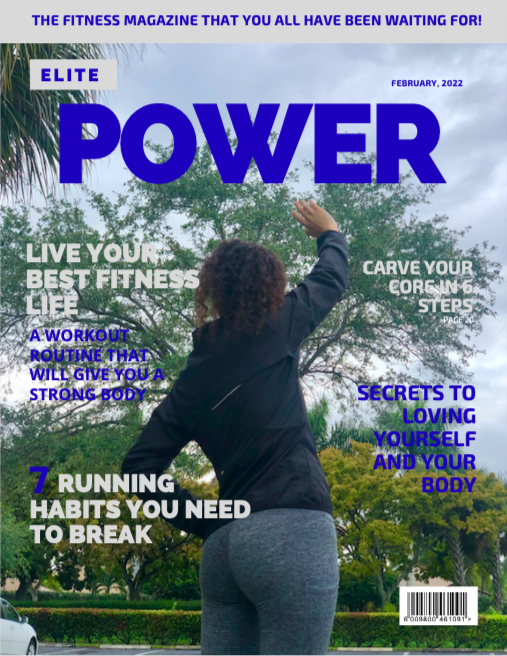
  • The Masthead font is Railway Heavy, I used this for most of my examples because I love how its boldness looks. For this draft I used a more serious palette: gray and blue. All the subtitle's font is Exo, which I think makes the cover look more organized.


  • For this draft, I kept the same fonts. The only difference is that the color palette is different: red, black and white. This one is my personal favorite, I just really like the combination of the colors and the vibe they give to the magazine.

  • This draft also has the same fonts for the masthead and the subtitles. The color palette is: violet, aquamarine and blue.

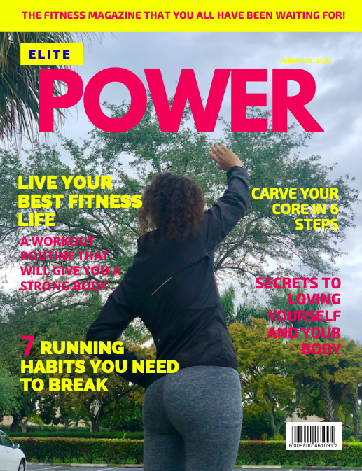
  • This draft is my second favorite of all of them. I changed the masthead's font for League Spartan and kept the same font for the subtitles. This color palette is more fun and attractive to the eye: yellow and pink. 


Friday, February 11, 2022

Test Shots

 Photoshoot! 

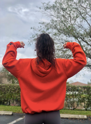
For today's blog post I am going to be showing you some pictures I took during the photoshoot for my Fitness Magazine. I took the pictures outside so the people that want to start a healthy workout routine but do not have a gym membership can relate to the pictures.


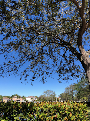
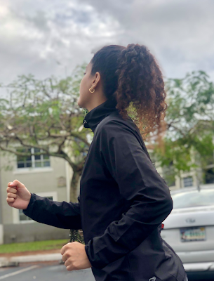
We took some pictures next to the lake and trees. When we went out it was sunny, but then it got cloudy, the pictures came out great still.We took a few pictures of us running.We took others where the poses represent power and strength. And finally some where we are stretching. 

Saturday, February 5, 2022

Shot Plans/ Page Layout Sketches: Contents Page

 Shot Plans/ Page Layout Sketches: Contents Page

My page layout will have have the tittle "contents" in big bold and colorful letters, located on the top of the page. The text and subtitle will be separated with lines from the image and the main page number. 

For the image, I have two options: A woman running in the park, she would be wearing exercise clothes like a jacket and legging, and her hair would be tied up. The other option is of a woman in a yoga pose, she would wear a tank top and leggings.


Masthead Analysis and Design

 Masthead Analysis and Design

In this blog post I am going to be analyzing the masthead of different fitness magazines in order to have an idea of what I want my magazine's masthead to look like.


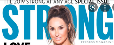
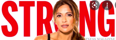
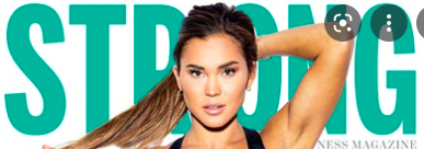
In "Strong" magazine, the masthead is always bold, large and all caps, but they often change the its color. Their masthead is a perfect example of how to catch the audience's eye. Most of the times, the masthead is partially covered by the model's head to make them stand out on the cover. 


"Shape" follows a similar conventions, their masthead is large, bold, and all caps. The color of the letters also tend to change to different vibrant colors and there is more space between each letter. Most of the times, the letter "A" in the masthead is replaced by the model's head to make the appearance of the cover more playful. 

For my magazine tittle block, I want to use a font similar to Staatliches or Impact. I will follow the conventions of the Fitness magazines: bold, big and colorful. 


Here are some examples:


Thursday, February 3, 2022

Audience Profile- Fitness magazine

 Audience Profile- Fitness magazine

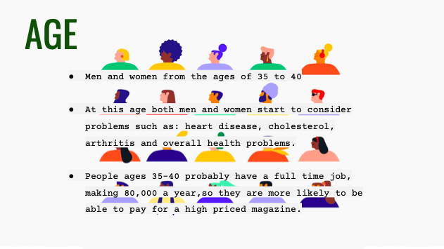
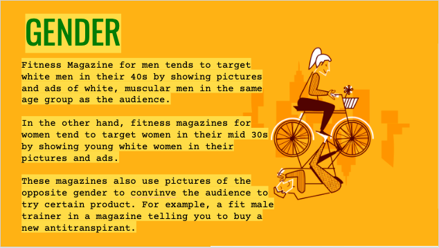
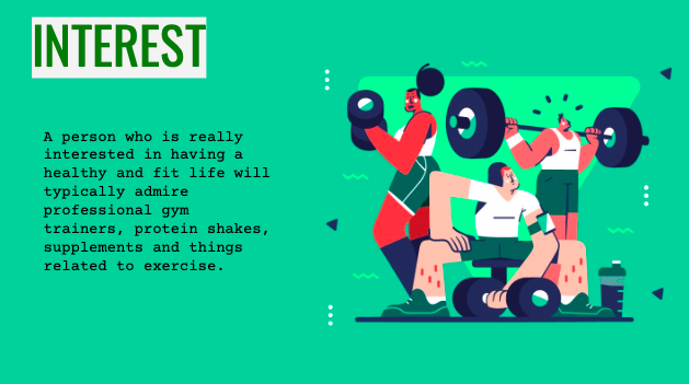
For this week's blog post I did a brief research on my fitness magazine's audience. I found out their ages, which gender reads this type f magazine the most, what their interests are and which ethnicity is most likely to appear in fitness magazines.


Fitness Magazine Questionnaire

 Fitness Magazine Questionnaire 

https://docs.google.com/forms/d/100WzTirwyYV1DQv23SLb54b1tgxL7JKrHg83sM5_qT8/prefill 


More of the people who filled out my questionnaire preferred to see a celebrity in the cover of the magazine. I believe this is a great option because it is most likely to catch a reader's eye if they see someone they recognize. 


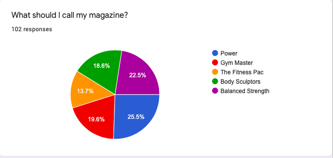
The most popular name voted for the magazine was "Power", which I will change for "The Power" because it sounds better.


The majority voted for seeing workout routines and nutrition and health info.


More of the votes went for purple and black as the color scheme, however, I am going to choose yellow and turquoise because those colors are more common to see in a Fitness Magazine.


The option that was voted the most was to take the photographs at a gym. This is because when people think about fitness, they automatically think of doing exercise and going to gym.


The majority voted to see articles of the latest workout routines in the front cover of the magazine.


The most popular option here was for the model of the cover to be lifting weights at the gym. But I would prefer the model to be stretching in the photographs.


The option which was voted the most was the one where the model would have to wear black exercise clothes and the second most voted was colorful exercise clothes , which is my favorite option. 


CCR Question 4

 How did you integrate technologies in this project? In the elaboration of my magazine I used Google Slides and Canva.